Cardlytics
To Activate or Not To Activate Offers for Debit Card users in Neobanks
Role: UX Researcher, ReOps, UX Mentor
Duration: Jan 2022 - Aug 2022
Industry: Fintech, Marketing Ads
Market: The US
Challenge: Redesign, Usability, Research Operations, Bootcamp
An example of current offer layout on a desktop. The usability testing highlighted the need to help people oriented between offers with different redemption mechanics, credit: Cardlytics
Overview
Cardlytics is a leading marketing and analytics platform that helps marketers reach consumers with relevant ads and incentives, like cashback.
This project aims on offer usability and discovery and activation process of rewards among neobank users.
Venmo Activatable Offers – made a significant impact through research findings on the implementation of new successful product improvements, such as activatable offers and a simplified onboarding process for new users
UXR boot camp – supported interns’ research of the needs and behaviors of neo-bank and traditional banking users
ResearchOps – organized UX research studies into a comprehensive research repository, furnished research tool comparison, collected user panel NDAs, and restructured internal storage
Outcomes
Improved marketing offer adoption and engagement for different redeeming mechanics
Increased user satisfaction and retention due to recommendations implementation on key pain points in the user journey
Contributed to the continued Cardlytics’ growth and the acquisition success
Increased the cross-functional team research buy-in and support for future initiatives
Links
Background: Cardlytics Acquired Venmo
The goal was to boost user engagement with personalized cashback offers in Venmo. To grow beyond traditional banks like Bank of America and Chase, Cardlytics leveraged Venmo’s debit cards, QR code promotions, and cashback incentives for merchant partnerships and transaction insights.
60M Venmo’s users Cardlytics ($CDLX) integrated to expand its cashback offers
25% (15M MAUs) expected to engage, later adjusting to a more realistic 10% (6M MAUs)
$10 redeemed offer per month will generate $2 in revenue for Cardlytics
More in Swanson Investment Research
Hypothesis
How might we make the offer environment as useful as possible to encourage Venmo customers to explore both activatable and non-activatable offers to save money on everyday purchases?
As a product team, we will test to understand if Venmo debit card customers will find our designs intuitive to use for both activatable and non-activatable offers.
Can customers notice activatable and non-activatable offer sections?
How do customers understand the difference between activatable and non-activatable offers?
Can customers navigate themselves in the learning on activatable offers and find all needed answers in this education?
Can customers easily activate an offer with no support by customer success?
As a product team, we will gain a deep knowledge of how customers intend to use our designs.
What do customers think about offers they need to activate?
What is the mental models' difference between newcomers and existing users?
How do customers explain to themselves the purpose of manual offer activation?
How do customers describe the benefit of having activatable offers?
Experiment #1: Activatable Offers
Procedure
I led a research project of 2 unmoderated usability testing rounds with 16 pre-screened active debit card users from 200 survey responses to gain user feedback on a new UX on a way to interact with an offer. The Usertesting platform was used for the test and the Respondent.io for the recruiting because there is no option on Usertesting to send participants the NDA for manual signing.
We also run collaborative discussions with stakeholders and the design team around typical user experience on the platform, quarter OKRs, and opportunities to change.
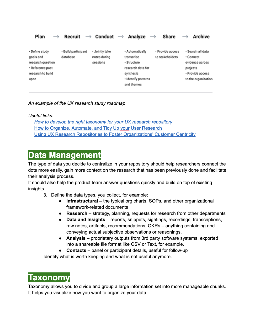
The research study roadmap is to find out if people are satisfied with activating offers by Venmo, credit: Cardlytics
An example of the respondent profile, credit: Cardlytics
Examples of tasks for the unmoderated usability testing study via Usertesting platform, credit: Cardlytics
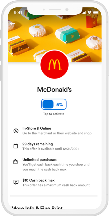
One of the screens for the tested behavior. The intention is to describe the offer page and tap on the button to activate an offer, credit: Cardlytics
Continuous research analysis and synthesis in Mural was shared with the product team during the weekly demos, credit: Cardlytics
Insights & Recommendations
Information Architecture:
Users failed to differentiate activatable vs. automatic offers
Recommendation: Reorganize offers into clear activatable vs. non-activatable categories
“Rewards” page lacked clear organization for intuitive browsing
Recommendation: Introduce improved search, map view, collections, and filtering options
Offer Activation:
Users found it easy to activate offers from the offer page but struggled with activation from the carousel.
Recommendation: Add better visual indicators (icons, labels) for activatable offers
Some users didn’t understand which card was linked to an offer.
Recommendation: Show indicators of credit and debit cards for activatabe offers
Many users expected an onboarding or tutorial when new features were introduced
Recommendation: Continue introducing an educational walkthrough for first-time users
User Engagement:
Active users wanted more control over activated offers, like deactivating or sorting
Recommendation: Allow users to manage activated offers
Many users preferred brand-relevant offers
Recommendation: Apply better personalization on recommended offers to redeem on the Rewards page
The findings apply not only to Venmo’s case but cover all entire Cardlytics’s products for consumers in traditional and neobanks.
Furthermore, our research highlighted the importance of ResearchOps for cross-functional collaboration and support for future initiatives on mental models for different user types (active, inactive, current, frequent, infrequent).
Experiment #2: UXR Boot Camp
I mentored interns for 3-months researching the needs and behaviors of neo-bank and traditional banking users. There were:
Literature review on public research about banking consumer segments
2-week diary study with pre-screening, onboarding in-depth interview, daily survey, and post-study interview
Collaborative analytics in Miro and Mural with chats via board comments and Slack
Theoretical education about being a researcher in the enterprise and the typical UXR working flow from understanding the problem to sharing the research findings
An example of the 2-week diary study synthesis about the neo-bank and traditional experience that I supported during the UX research boot camp, credit: Cardlytics
Also: Research Operations
1. I produced a detailed analysis of the previous research studies that should be included in the repository. This analysis involved identifying patterns, trends, and key insights from the data. I structured the internal storage with all deliverables and NDA data, effectively managed and organized research data, ensured the legal and ethical conduct of research, and provided the necessary infrastructure for conducting high-quality, impactful research.
2. It was necessary to select the most appropriate repository for data storing and sharing with the team. The intention was to utilize this repository also for experiments conducted by the data analytics team.
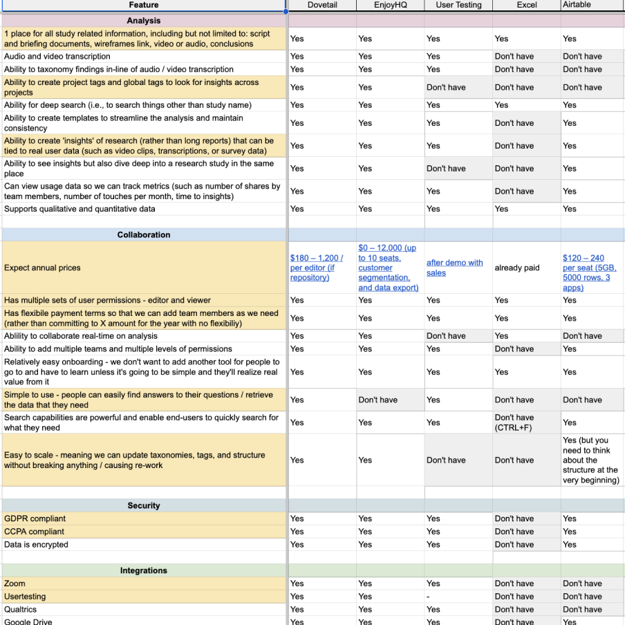
I provided a comprehensive comparison of repository options and made an atomic-structured research database into Airtable, credit: Cardlytics
I established a comprehensive research repository in Airtable for easy tracking of atomic insights from both past and future studies. Even though this tool doesn’t have a lot of features that could make the researcher’s life easier, it was selected because of the similarity of experience with Excel the team used to operate with.
I developed an advanced taxonomy for the repository to make it easier to find relevant information, such as the type of research conducted, the features or products being studied, the user groups involved, or the nature of the insights (e.g., behavioral, attitudinal, etc.).
I mentored interns on internal working patterns for migrating data to a new repository.
With advanced taxonomy and tool extensions, the UX research repository made it easy for other teams to incorporate the insights into their work, credit: Cardlytics
Outcomes
Improved clarity in offer activation to reduce user confusion
Increased user engagement with rewards for higher adoption rates
Addressed design changes to make offers easier to find, simpler to redeem, and tailored to user behavior
Planned future research based on previous atomic insights to evaluate the impact of changes, explore brand relevancy, and personalization for mental models
Lessons Learned
Optimize the offer environment
Users struggled to differentiate activatable vs. non-activatable offers, and the Rewards page lacked clear organization. We suggested reworking the information architecture, adding clear activation indicators, and introducing better offer categorization for discoverability.
Structure ResearchOps and cross-functional collaboration
Aligning UX research findings with product, marketing, and engineering teams was complex due to different tools, priorities, and timelines. We created a centralized repository of research nuggets to make key findings easily accessible for cross-functional teams for quicker decision-making.
The UXR boot camp was a win-win
Many stakeholders had limited exposure to UX research methods. Through the UXR Boot Camp, we gathered foundational findings on how traditional and neobank users interact with offers. The boot camp also served as an investment in future UX research talents to hire.


